We thought this article would be of value to our customers who purchase our mannequins for their online stores and need product photography tips.
The is the second installment of the article, for tips 1-3 read yesterday’s blog post here.
This article is a reprint from Pixelz.com. Pixelz is the leading product image editing service for internet retailers, bloggers, designers, photographers, and webmasters.
Mistake #4: Not Utilizing Enough Light
Don’t be that ecommerce retailer whose product images look dingy and underexposed. Bright lighting should be one of your biggest concerns as an online apparel retailer.
Ensuring that you expose images correctly will showcase products’ colors and other details accurately, as well as make your inventory appear clean and professional.
Not very good lighting. Light from a lit room
(High Quality Lighting- Lighting Kit Lit)
All clothing is different and having the right lighting will allow customers to appreciate the unique facets of your garments.
Ample lighting also allows your camera to produce higher quality images with less “noise” or “grain” and more sharpness. The darker the lighting situation, the poorer the image quality—and poor image quality will not flatter your products!
The most flexible way to ensure that you have sufficient lighting is to rent artificial lighting equipment, but in the event that renting equipment is not in your budget, try using natural light from a large window and a reflector panel made from foam board. Read here for more advice on lighting kits and setups.
Bright lighting should be one of your biggest concerns as an online apparel retailer.
Mistake #5: Not Using the Correct Camera Settings
If your camera settings are wrong, then no amount of Photoshopping expertise will be able to make your images look professional. DSLR cameras can produce photographs of extremely high qualities, but incorrect settings can drastically reduce that quality. Make sure that you understand ISO, aperture, and white balance before you photograph your products.
- ISO
Make sure that your ISO is no greater than 600-640. Higher ISOs produce distracting “noise” or “grain,” which are grayish or colored speckles that make photographs look more filmic.
The higher you go, the worse the noise will be. More than that, at higher ISOs, the camera can’t capture as much sharpness, so details begin to look soft. Using a tripod will allow you to keep your ISO at 100 or 200 for optimal clarity and sharpness.
ISO 640
ISO 6400
- Aperture
Aperture, which is represented by the f number of your camera settings (e.g. f/16, f/2.8) controls focus. Generally, the larger the aperture number, the more aspects of the image will be in full focus.
In our above example, more of the garment is sharper at f/22 than it is at f/3.5. Thus, make sure to set your aperture higher than f/11; this will allow for all aspects of your products to be in complete focus.
Aperture 3.5
Aperture 22
- White Balance
White balance refers to the color cast of the image. Orange and red hues are generally referred to as being “wamer,” with purple and blue hues as “cooler.”
The color cast of an image depends on the light source being used and the camera’s white balance setting, which controls how the camera interprets the colors that it records. There are many different types of light sources, but the most common are tungsten, fluorescent, LED, and natural sunlight.
Tungsten
Fluorescent
Flash
Auto
You can set your white balance specifically according to the type of light source that you are using or set your white balance to AUTO and let the camera decide.
Whatever you choose, don’t forget about white balance or you may find yourself hard-pressed to try to recreate accurate colors in Photoshop. For more help with setting your camera, check out our articles on ISO, and general manual camera settings.
The most common light sources types are tungsten, fluorescent, LED, and natural sunlight.
Mistake #6: Not Setting the Correct Color Space Profile
Many apparel photographers forget or don’t know about the very crucial step of converting edited photos into a web-ready color space profile. Color space is a specific range of colors that can be presented in a given image.
Some options for color spaces are Adobe RGB, CMYK, and SRGB. Without the correct color space, colors of products will look totally different when viewed on different computer screens, web browsers, and even websites. SRGB is the best color space profile to keep your images consistent and vibrant between the various screens, browsers, and sites.
You can choose to set your camera to SRGB, thus eliminating the extra step of converting the file to SRGB after you edit it. However, SRGB captures a narrower range of colors than your camera’s RGB default, so many professionals choose to make the conversion only after they have perfected their images to avoid limiting their editing capacity.
Mistake #7: Not Editing Properly
Many ecommerce retailers edit their product images improperly, especially with regards to cropping, alignment, color, and backgrounds.
It’s best to keep all crops, alignments, and backgrounds identical from image to image in your inventory. To keep all images consistent in relation to one another and cut back your post-processing time, make sure to develop a standard set of specifications for both shooting and editing.
- Alignment
Make sure that your products are all the same size and are centered within your image so that all of the angles, corners, and edges of your products line up in relation to one another.
Having a consistently-aligned inventory will absolutely boost the appeal of your website and products. The easiest way to ensure that your alignment is spot on is to create guidelines in a Photoshop template.
- Cropping
Similarly to alignment, it is imperative that you crop product images identically so as to provide the customer with a seamless online shopping experience.
If you use guidelines for alignment, then cropping consistently and sizing images according to your website’s image specifications should be no problem.
- Backgrounds
Some ecommerce companies choose different backgrounds to display different products. Although this may seem unimportant, keeping all of your product images consistent in relation to one another can drastically improve the professionalism and appeal of your website and inventory selection.
Choosing one background style and sticking to it can also shave off post-production time. It is generally agreed upon that whit or light grey backgrounds are best.
- Colors
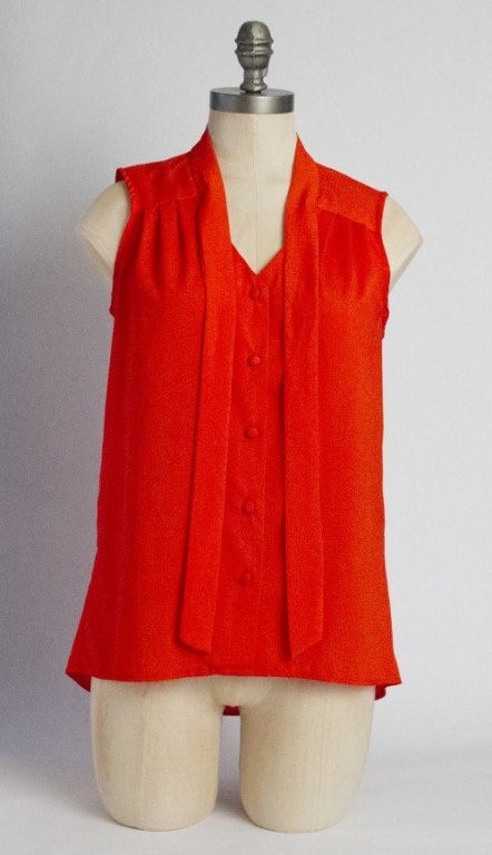
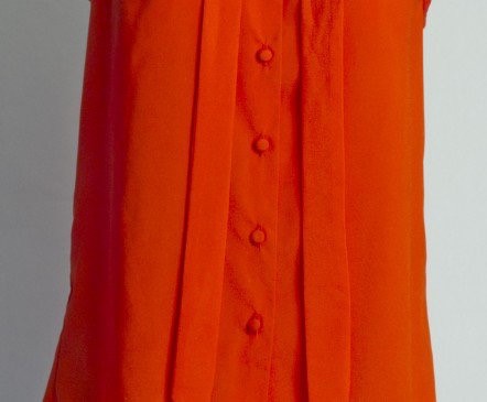
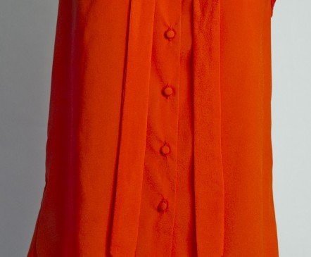
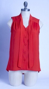
Another common mistake in apparel photography is inaccurately representing garments’ colors.
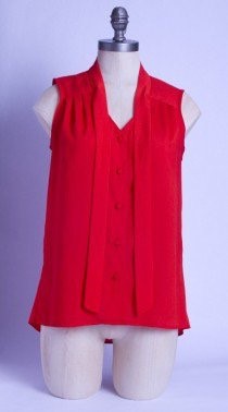
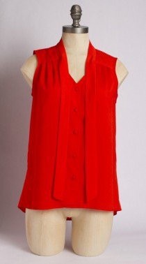
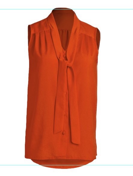
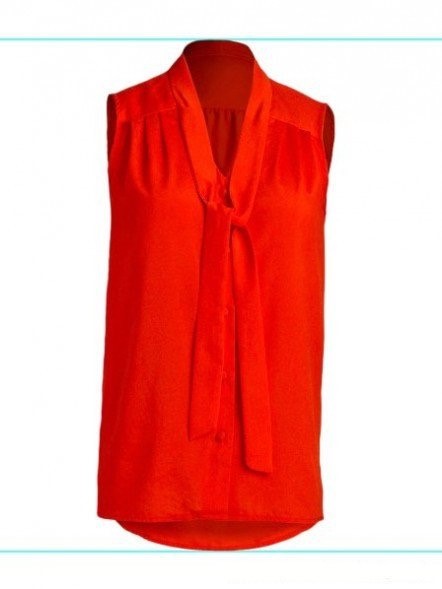
Although the camera does a great job creating fairly-accurate coloring if you allow it to decide white balance for itself with AUTO mode, some colors—such as neons, reds, and pinks—are difficult to photograph correctly in camera and often need to be tweaked in Photoshop.
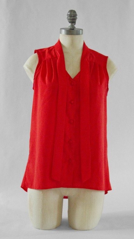
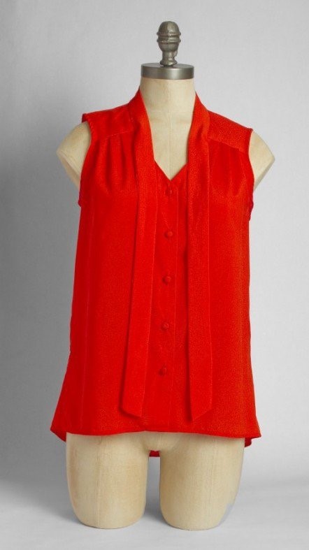
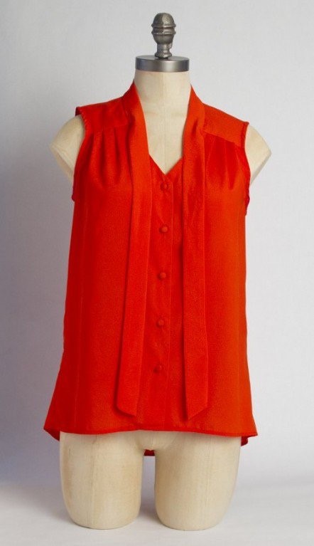
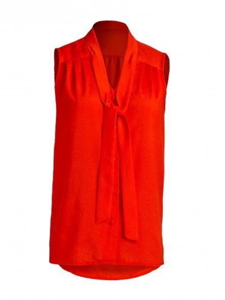
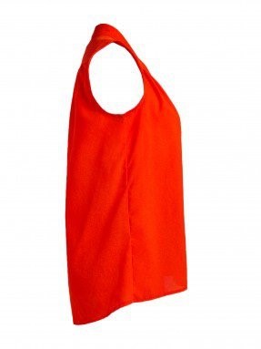
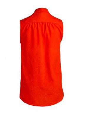
Here are three variations of red.


Inaccurate representations of colors can leave customers frustrated and dissatisfied, so taking a few extra minutes to ensure that the colors of your garments are accurate before you upload them to your website is a good idea.
The bottom line is that you want the customer to see exactly what they will receive in the mail should they order your product.
There are a number of ways to tweak colors, so get to know Photoshop’s offerings and choose your favorite tool.
After you have fixed the colors, make sure to convert your images into SRGB format to make sure that different browsers, computer screens, and websites won’t change the accurate colors that you worked so hard to create for your customers.
Now that you know the 7 most common mistakes in apparel photography, you have the opportunity to correct your workflow and get back on track to creating wonderful product images for your customers.
Banishing these bad habits will help your ecommerce website’s consistently and your customers satisfaction overall.